
How to preview a website on different-sized devices?
Every web designer should ensure that the website is compatible with all the screen sizes. It is known that every device like the laptop, mobile phone, and tablet has its own screen specifications by default. So, Web designer needs to consider all the devices sizes while designing a website otherwise the website might fail and looks awkward on incompatible devices.
Considering the issue, it is always important to verify and ensure that the website is working fine on all the devices. To tackle this, Google has introduced one of the screen emulator tools online which help not only designers but also site owners to cross-check the size compatibility. The tool is named as Resizer which is free to all and it will preview on all sorts of devices.
Important to note that it only works for the websites already developed and deployed. It previews only the websites that are live on the web. If there is an issue with page loading then it reports an error.
Let’s see how this Google’s Resizer helps in previewing the site on all the devices.
Table of contents
Here’s step-by-step sequence
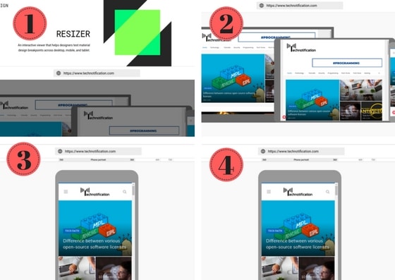
Image Courtesy: Screenshots from Resizer
1. At first, land on the webpage design.google.com/resizer
2. Now, it will take you to the page where the search box and three icons(Laptop, Tablet, Mobile Phone) are displayed
3. Make sure to enter your website address, For example in this article, I entered https://www.technotification.com
4. Now, Click on the Laptop icon to see the preview on the laptop-sized devices
5. Click on the Tablet icon to preview the website on the screen size of the tablet
6. Finally, Click on the mobile phone icon to preview the site
In every step of previewing make sure the components and elements of the website are not misplaced. If anything misplaced send to the testing to solve the issue.
Did you use any alternative similar to Google Resizer?