Visual Trends To Look For In 2023
Pardon my intrusion, but hello there. This is the fourth year I’ve written a trends report on user interface design, and it’s become something of a personal custom. The 2023 edition has been created in the same way as previous ones: carefully, taking a few…
Certain tendencies either persisted or developed into something new and distinct. Some fashions have (hopefully) run their course. Even more surprising is the resurgence of several formerly popular styles.
Table of contents
1. Motion Design
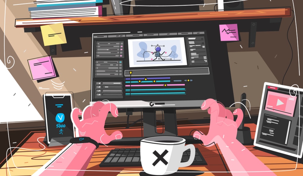
The prevalence of motion design attests to its meteoric rise to fame. Users nowadays demand UI to visibly “live and breathe”; therefore, designers must include everything from simple microinteractions to elaborate animations.
People’s attention spans are becoming shorter and shorter as a result of apps like Tiktok and Instagram and the steady stream of moving content that its users utilize on a daily basis. Some people think we’ve sunk to the level of a goldfish or even lower. Moving elements and attempts to breathe life into otherwise static displays and pictures are necessary to maintain users’ interest and curiosity and make the experience more immersive.
2. Clean Design
My aesthetic has developed over the years, and I’ve moved toward a more basic, clean style. The notion that a clean, basic style seems to be something that you’ll never go awry with is both eye-opening and reassuring, even if it isn’t always the natural path for every designer.
When I’m searching for a new app or website, the ones with the cleanest and most simple designs always stand out as the ones I like using the most. You may make a successful contemporary digital product without adhering to every fad.
It’s OK to take cues from current fashion trends so long as your finished products maintain an air of timeless elegance. The reason why developments in
seems like too much to handle, but it’s a welcome reprieve for any designer.
3. High Contrast / Monochrome
Many websites and applications, even those created by the most well-known names in the business, have portions with stark color contrasts. The frequent flashing of dramatically juxtaposing elements/surfaces when you navigate through the dashboard might drive your concentration, which is why I believe this trend has arisen for the same reason I indicated before in this piece.
Also, the high readability of the interface’s components and text alleviates any concerns about potential eye strain from prolonged usage.
4. Dark futuristic/cosmic UI
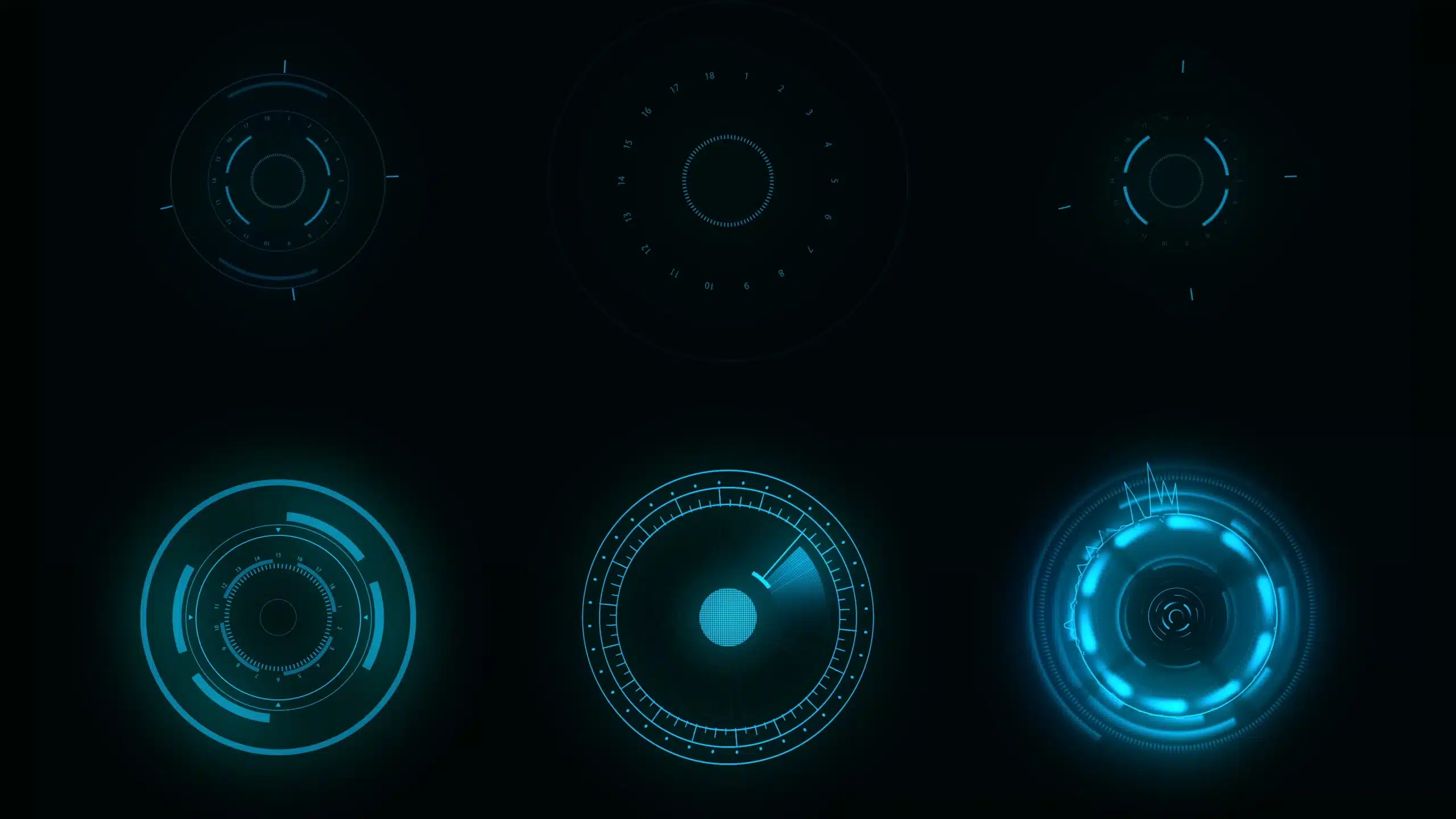
The concept of “night/dark mode” has expanded into the broader concept of “dark UI.” In fact, more and more companies are adopting a black theme for their offerings. Dark user interfaces are more contemporary and exciting than the standard “content on the white backdrop” design, and I believe they are more likely to attract the user’s interest.
